Wireframing on the Applet whiteboard
Wireframing lets you turn your ideas into something concrete - so when you’re collaborating with AI, it knows exactly what you want to build.
AI models are very good at building things similar to those we’ve seen before, but if you’re trying to describe a novel concept or specific approach, this is your secret weapon.
Take the expanding gradient in this landing page: you could get there with a prompt, but it's often easier to just draw it out:

This article covers all of the tools at your disposal, and has a reference sheet of all the keyboard shortcuts at the end.
You’ll find all of the wireframing tools in the toolbar on the left, and many of them have their own specific options for customization, which you’ll see in the context bar on the right:
Tip: You can switch on text labels for the toolbar if that helps you remember where all the tools are. 👌
Text Copied! Link to this section
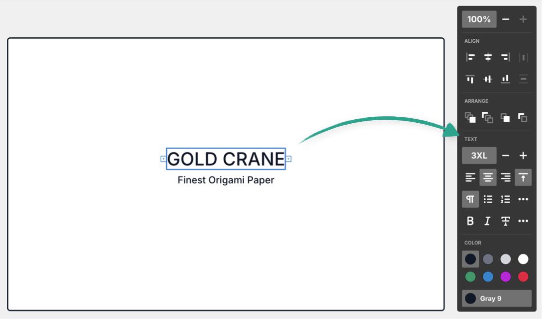
Add text to your wireframe to show exactly where your copy needs to go, and what it should say:

You can customize your text in the following ways:
- Size - From XS to 8XL
- Alignment - Left, center, or right aligned
- Type - Paragraph, H1, H2, H3, bulleted list, numbered list, checklist
- Style - Bold, Italic, Strikethrough, Code, Highlight, Link
- Color - choose from a range of hues, then customize the exact shade (perfect for keeping to a consistent color scheme
Pro tip: Text in a wireframe can be interpreted by AI models in different ways.
For example if you write “Example testimonial”, you'll get a generated testimonial for this spot. Whereas, things like button names and large headings are generally interpreted literally - you can always instruct the AI model one way or another.
There is also placeholder text available under the components menu, which is perfect when you want AI to generate your content without typing anything at all. 👍
Shapes Copied! Link to this section
You can add shapes to the board, as part of a wireframe or (more usefully) as a flowchart or diagram to demonstrate the logic your applet should follow, for example a sitemap, a process diagram or any other kind of flow.
Hold Option (or Alt) and hover over a shape for “quick-add” buttons, so you can stay in the flow (pun intended):

Shapes can be customized in the following ways:
- Add text (text can then be customized independently with the styles listed above)
- Color - choose from a range of hues, then customize the exact shade (perfect for keeping to a consistent color scheme)
- Border/fill style - Solid color, solid outline, dashed outline, and an additional toggle for fill transparency
- Shape - if you picked the wrong shape, or need to change it, you can do that here, the shapes can also be rotated in 90 degree increments
- Add an icon from our extensive library - get creative
Components Copied! Link to this section
This section is the big one, so buckle in.
Applet has a range of pre-built UI components you can add to your wireframes, and customize in many different ways. The component menu is searchable too, for quick and easy additions.
All components can be colored to suit your design, and any with text offer the same text styling options listed above.
All input components (like text fields, dropdowns, and checkboxes etc) also support an optional label.
The specific customization options for each component are:
Avatar placeholder (PH) Copied! Link to this section

Change the style, shape, icon or color (much like shapes ☝️), you can also add text.
Button & Button, outline Copied! Link to this section

Add an icon and choose from active or disabled states, after creating you can switch between the two styles (solid orm outline).
Checkbox Copied! Link to this section
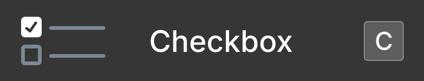
Choose from the following states:
- Normal
- Selected
- Indeterminate
- Focused
- Error
- Disabled
- Disabled, selected
Dropdown Copied! Link to this section
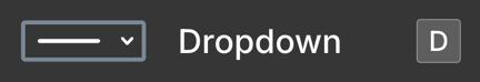
Add as many options to the dropdown as you like, then choose one of the following states:
- Normal
- Focused
- Error
- Disabled
Input Copied! Link to this section
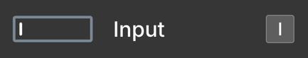
Add an icon and/or placeholder text, then choose a state:
- Normal
- Focused
- Error
- Disabled
Map placeholder (PH) Copied! Link to this section

Nothing to customize here, but you can drag to resize the map.
Overlay Copied! Link to this section

Overlays will automatically snap to fit your frame, but you can drag to adjust their size and placement. You can choose a color, but it’s not possible to adjust the opacity.
Tip: Picking a lighter shade will make the overlay seem more transparent 👌
You can move other elements above or below your overlay with the following shortcuts:
- Bring forward:
] - Bring to front:
Option(orAlt) +] - Send backward:
[ - Send to back:
Option(orAlt) +[
Photo placeholder (PH) Copied! Link to this section

Change the style, shape, icon or color (much like shapes ☝️), you can also add text.
Progress bar Copied! Link to this section
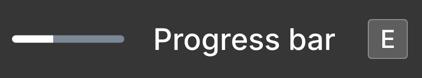
Drag the toggle to change the progress indicator (i.e how “full” the bar is).
Radio button/s Copied! Link to this section

Add as many options as you like, and then select from the following states:
- Normal
- Selected
- Focused
- Error
- Disabled
- Disabled, selected
Tip: You can also select individual options and adjust their state separately.
Slider Copied! Link to this section

Drag the toggle to adjust the slider position.
Stars Copied! Link to this section

Drag the toggle to choose how many stars are filled in.
Table Copied! Link to this section
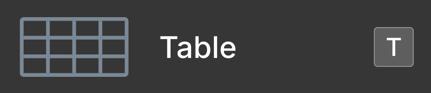
Click the plus icons to add rows or columns, drag to reorder them. You can change colors at the whole table level, or on individual cells.
Tabs (horizontal, vertical & mobile) Copied! Link to this section

After selecting any of these components, you can switch between them from the options palette, add or remove tabs as needed, add icons, and choose from these states:
- Normal
- Selected
- Disabled
Tag Copied! Link to this section

Choose a style (solid or outline), and optionally add an icon.
Textarea Copied! Link to this section
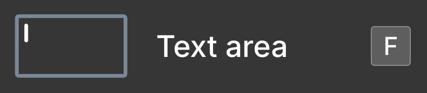
Optionally add placeholder text, choose an icon, and pick a state:
- Normal
- Focused
- Error
- Disabled
Text, mock & Text placeholder (PH) Copied! Link to this section

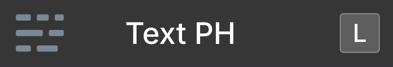
Choose between lorem ipsum text, or blocks - click the buttons again to regenerate the random content. Use the text formatting options to adjust size and alignment. At any point you can convert a placeholder to editable text with this button:

Toggle Copied! Link to this section

Pick from one of four states:
- Off
- On
- Disabled
- Disabled, on
Tooltip Copied! Link to this section

Drag the toggle to pick the exact location of the arrow, or select a direction from the picker.
Video placeholder (PH) Copied! Link to this section

Change the style, shape, icon or color (much like shapes ☝️), you can also add text.
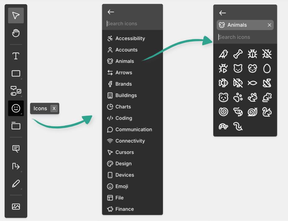
Icons Copied! Link to this section
Applet comes with 1000+ built in icons, all of which are clean, simple and endlessly scalable. They’re grouped by category, or you can search the icon menu for exactly what you need - like a nice lil bird.
Applet will use the exact same icons you choose when building, so this is a great way to have full control.
Frames Copied! Link to this section
Starting with a frame is a good foundation, whether it’s a page of your website, or a screen in your app. You can drag the frame to be any size you like, and label it to keep things organized:

Tip: Use connectors, or match your frame names to button labels to illustrate the logic that your applet should follow.
Annotations Copied! Link to this section
Annotations are like a micro-prompt that lets you point at a specific element (or group of elements) and instruct the AI model what to do with it (like animations, styles or fixes if you’re iterating).
Simply place the annotation with a click, and drag the arrow to the element you’re describing. You can also add icons or style the text in your annotations

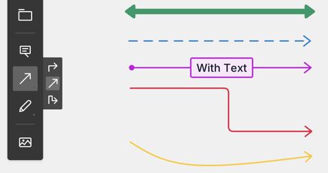
Connectors Copied! Link to this section
Connectors are a great way to show transitions and movement between pages/stages in your app, you can pick from 6 different endpoints (or none). Connectors can have smooth curves, clean elbows or be dead straight. They can be solid, dashed or thick. Label your connectors, or color code them. They’ll automatically snap to elements at either end too.
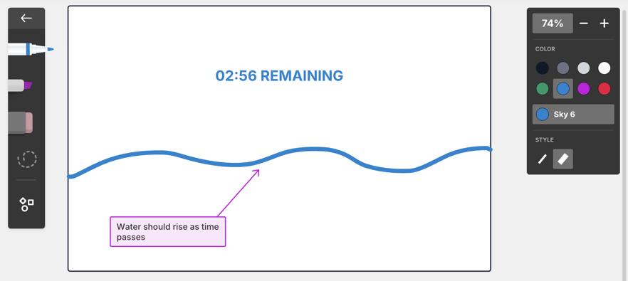
Marker mode Copied! Link to this section
The more creative your designs, the handier you’ll find marker mode - it lets you draw free-hand with thick or thin lines plus highlight in a range of colors and shades. Shape detection is also very useful if your drawing skills are limited like mine. To edit your drawings you can use the eraser, or select drawn elements and move or delete them. It’s perfect for illustrating the more organic parts of your ideas
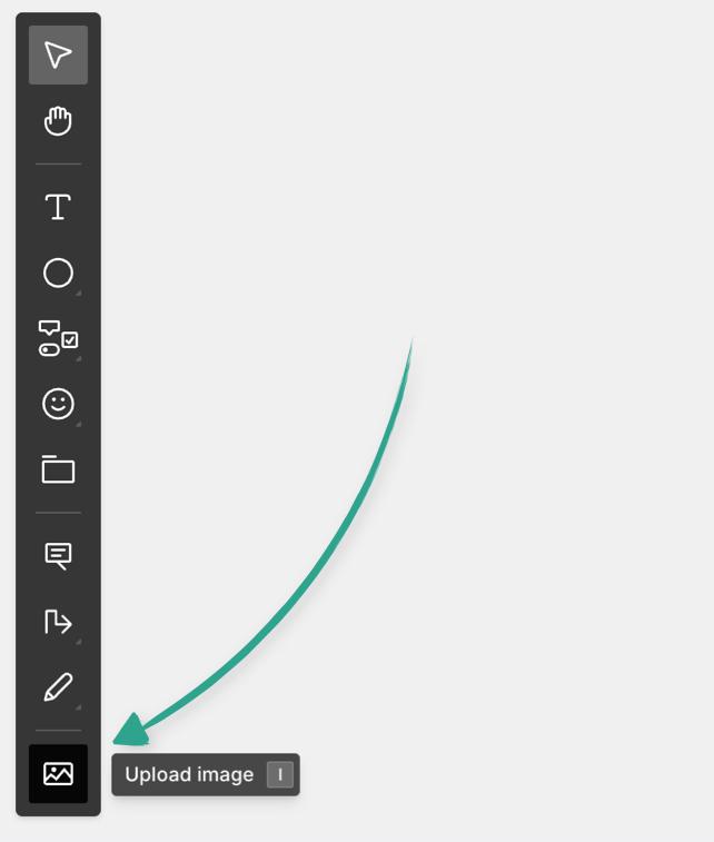
Images Copied! Link to this section
Whether you want to use specific images in your app, or you just want to provide inspiration and guidance to the AI model, uploading images is a simple way to do this. Hit I to upload them on the board or drag and drop them directly from your computer. Combining them with annotations can be particularly helpful. 👍
You can also paste images into your prompt.
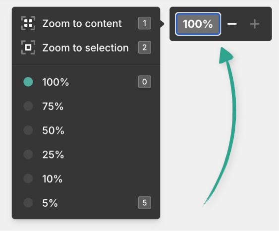
Zoom controls Copied! Link to this section
You can zoom in and out of the board with the controls in the top right corner, or use the keyboard shortcuts listed below. Open the zoom menu to see them.
Wireframing shortcuts Copied! Link to this section
ACTION | MAC | WINDOWS |
|---|---|---|
Select mode |
|
|
Pan mode | Hold | Hold |
Add text |
|
|
Add rectangle (square) |
|
|
Add line |
|
|
Add oval (circle) |
|
|
Open shape menu |
|
|
Open component menu |
|
|
Open icon menu |
|
|
Add frame |
|
|
Add annotation |
|
|
Add connector |
|
|
Draw with marker |
|
|
Upload image |
|
|
Zoom in |
|
|
Zoom out |
|
|
Zoom to content |
|
|
Zoom to selection |
|
|
Reset zoom to 100% |
|
|
Zoom out to 5% |
|
|
Undo |
|
|
Redo |
|
|
Cut |
|
|
Copy |
|
|
Copy as image |
|
|
Copy link to object |
|
|
Paste |
|
|
Paste style (on objects) or |
|
|
Save as default style |
|
|
Select all |
|
|
Find... |
|
|
Preview mode |
|
|
Exit preview mode |
|
|
Hide chat |
|
|
Show chat |
|
|
Shape shortcuts Copied! Link to this section
Active with the shape menu open (S)👇
ACTION | SHORTCUT |
|---|---|
Add pill |
|
Add diamond |
|
Add triangle |
|
Add parallelogram |
|
Add flipped parallelogram |
|
Add trapezoid |
|
Add hexagon |
|
Add cylinder |
|
Add cross |
|
Add bracket |
|
Add cloud |
|
Add star |
|
Component shortcuts Copied! Link to this section
Active with the component menu open (W)👇
ACTION | SHORTCUT |
|---|---|
Add avatar placeholder |
|
Add button |
|
Add checkbox |
|
Add dropdown |
|
Add input |
|
Add map placeholder |
|
Add overlay |
|
Add photo placeholder |
|
Add progress bar |
|
Add radio button |
|
Add slider |
|
Add stars |
|
Add table |
|
Add tabs |
|
Add tag |
|
Add text area |
|
Add text, mock |
|
Add text placeholder |
|
Add toggle |
|
Add tooltip |
|
Add video placeholder |
|
Marker shortcuts Copied! Link to this section
Active with the marker menu open (M)👇
ACTION | SHORTCUT |
|---|---|
Use highlighter |
|
Use eraser |
|
Free select mode |
|
Layout shortcuts Copied! Link to this section
Active with an object or objects selected on the board
ACTION | MAC | WINDOWS |
|---|---|---|
Bring to front |
|
|
Send to back |
|
|
Bring forward |
|
|
Send backward |
|
|
Center horizontally |
|
|
Center vertically |
|
|
Align left |
|
|
Align right |
|
|
Align top |
|
|
Align bottom |
|
|
Group |
|
|
Ungroup |
|
|
Enter group |
|
|
Exit group |
|
|
Lock / Unlock |
|
|